z-scores: Giving Meaning to the Numbers

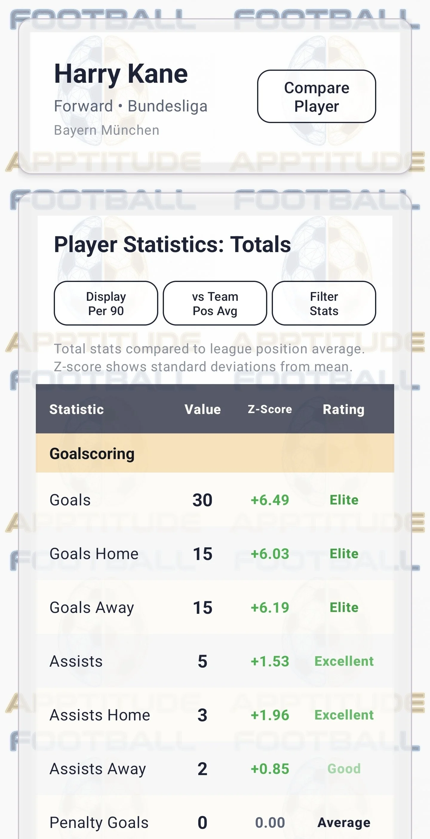
When you see your team linked with a striker in the Eredivisie that scored 30 league goals last season it can be tempting to get excited about the numbers. However, it is also important to understand how impressing that stat actually is.

On its own, 40 is just a number. It could be a record that stands for a decade, or a total three other strikers also beat that year. The raw stat can't tell you which.

A z-score can. It measures how far a value sits from the average of a chosen group, counted in standard deviations, the natural spacing of the group itself. Zero is dead average. One is clearly above it, two is exceptional, and negatives fall below.

Because the score is measured against a group rather than counted in goals, it stops describing how many and starts describing how rare: not "he scored 30" but "he scored like almost no one else in that population."

How Football Apptitude Uses z-scores

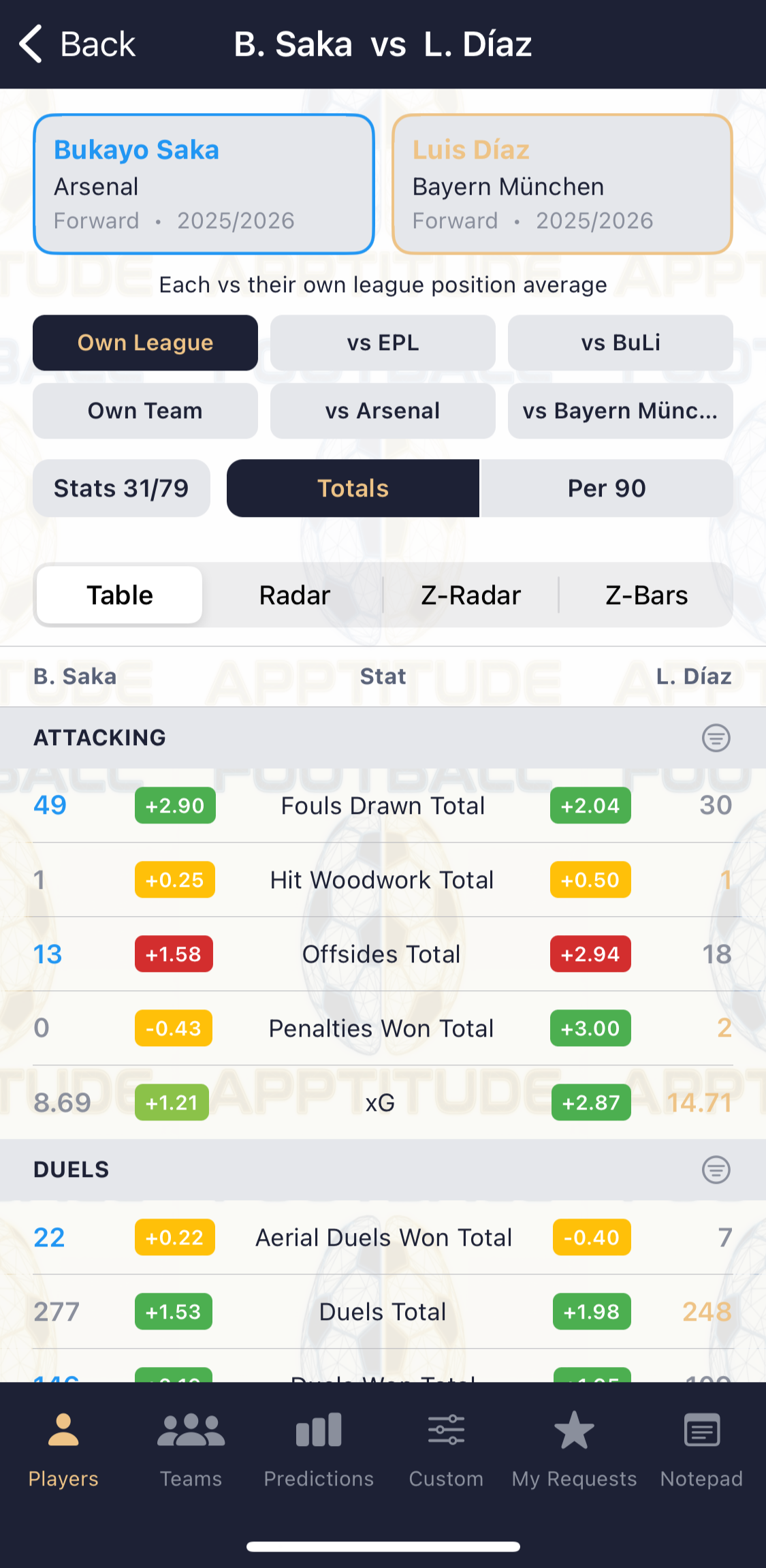
Every stat in Football Apptitude carries a z-score calculated against a relevant reference population, such as the league average for that season, the team average for midfielders, and so on. These are pre-computed and stored alongside each player's and team's raw stats, so they are always available instantly.

Rather than making you read decimal z-values, the app translates them into bands with a fixed colour language:

  • Excellent (z ≥ 1.5) — green

  • Above average (0.5 ≤ z < 1.5) — light green

  • Average (−0.5 ≤ z < 0.5) — yellow

  • Below average (−1.5 ≤ z < −0.5) — orange

  • Very poor (z < −1.5) — red

That colour language is universal throughout the app and scales displayed to help. Whether you are reading a stat table, scanning a radar chart, or looking at a diverging bar chart, green always means strong and red always means weak, relative to the comparison context in use.

When a Lower Number is Better

A higher number does not always mean a better performance/ Stats like goals conceded, fouls, and yellow cards are all stats where the good end of the scale is the low end. The app knows which stats these are and flips the z-score sign before assigning a band, so the colour coding stays intuitive: a team that commits very few fouls shows green, not red. You never have to remember which direction a stat runs.

Why This Matters

Two things become possible once every stat is a z-score that neither raw numbers nor percentages can do.

You can compare across populations: A z-score is always relative to a group you chose (e.g.: a league, a season, a position group, a single team). This means questions like "how would this team's numbers rank in a different league?" becomes a question with an actual answer, rather than a guess distorted by the difference between competitions.

You can compare across stats: Goals, possession, and tackles live on completely different scales, and no chart can honestly show them side by side in raw form. As z-scores they share one scale (distance from average) so a single chart can show at a glance where a player or team is unusual, in either direction, across every dimension at once. That is what the radar and diverging bar charts in the app are actually drawing.

Choosing which group to measure against is the heart of the comparison tools, and it is covered on the Player Data and Analytics page.