Player Data and Analytics

One of the main drivers behind the creation of Football Apptitude was the desire to provide users with a tool that would enable fast, detailed analytic features that try to account for some of the more common blind-spots encountered in other sports data interfaces. In other words, giving the user a strong dataset, available quickly, with meaningful comparisons.

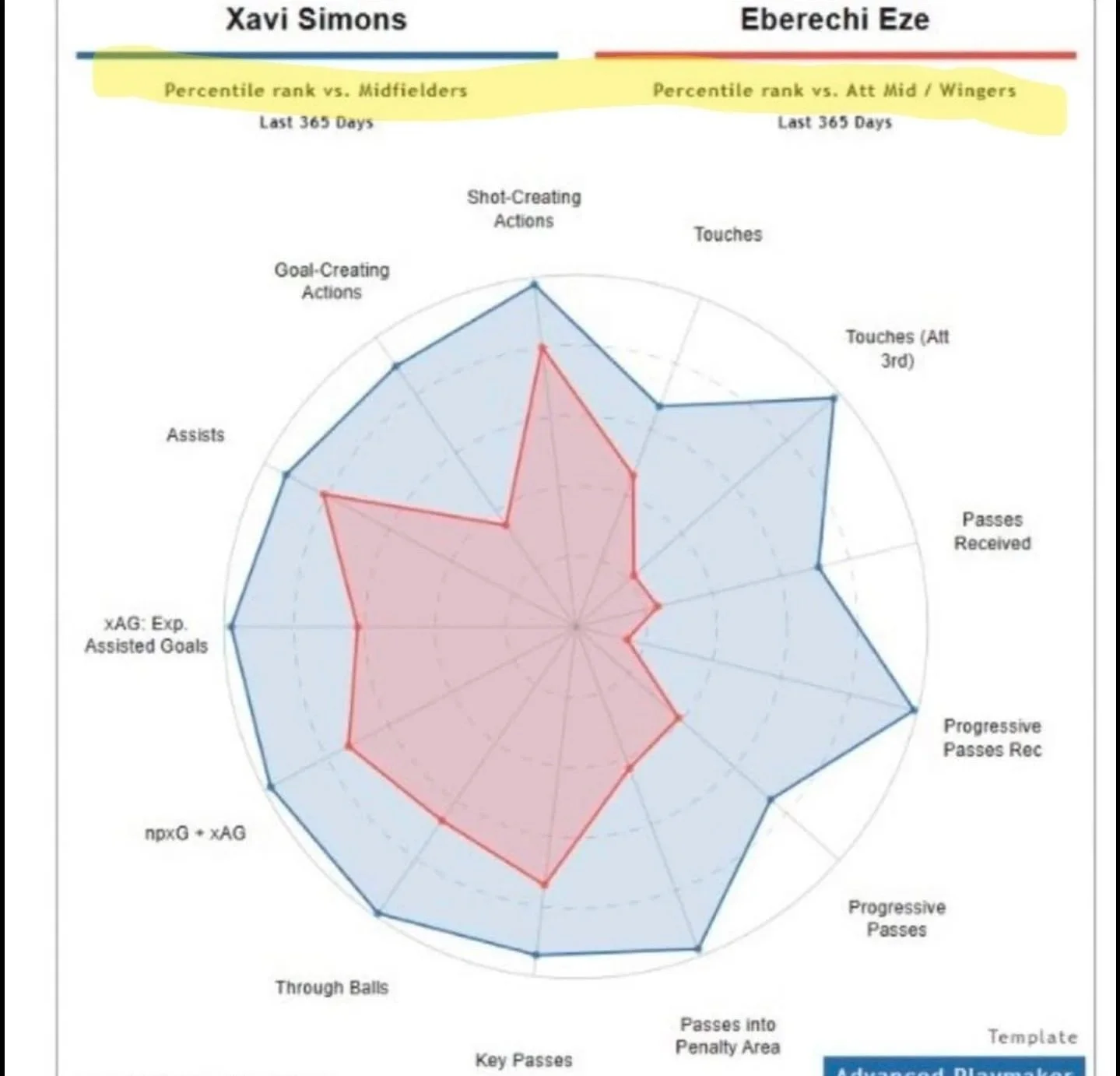
In particular, I was infuriated by the most dreadful player comparison chart I had ever seen. The chart in question was obviously a serious case of “cope” doing the rounds on Tottenham twitter after they completed the signing of Xavi Simmons (following Eberechi Eze moving to rivals Arsenal).

These kind of ‘Apples to Oranges’ charts often do the rounds during transfer windows,
and it’s often for some combination of the following reasons:

  1. Fans being intentionally deceptive to make themselves feel better.

  2. Its really hard to get good data for good comparisons.

Nothing can be done about the first one… but something can be done about the second one.

What Football Apptitude does Differently

Charts like this waste your time because they withhold the information you would need to check them. Look again at the cope chart and try to answer three questions.

Compared to whom? The two players are benchmarked against different position groups, and the chart never tells you what the benchmark population actually is. Is Xavi being measured against every midfielder in the world? Against Bundesliga midfielders, where he was playing? Against Premier League midfielders, where he was going? Each would produce a different chart, and without knowing which one you are looking at, the numbers mean nothing.

Over how much football? The chart uses aggregate totals across 365 days. One player may have played twenty more games than the other. You can't tell.

In which league's context? Xavi shows more passes received — but is that an easier stat to accumulate in the Bundesliga than in the Premier League? You can't tell that either.

Who is the benchmark? What is the sample? Which league's context do the numbers live in?

Those three unanswered questions are the entire problem, and Football Apptitude is built so that none of them is ever left open. Each one is an explicit, visible choice, and every comparison is expressed as a z-score against the benchmark you chose, so you can see not just that one number is bigger than another, but how unusual each number is among the players it should be judged against. Read more about z-scores here.

Choosing the Benchmark

When you compare two players, you decide who the yardstick is. You can benchmark both players against the positional average of either player's league (Player 1's league, Player 2's league), or let each player be measured against his own. So for a forward moving from the Bundesliga to the Premier League, you can ask how both players rank among Bundesliga forward players, how both rank among Premier League forwards, or how each ranks in the league he actually plays in. The charts in the app will always tells you which of those you are looking at.

The same choice exists at club level. Both players can be compared against either club's positional average, or each against his own teammates. That last one answers a question aggregate charts never can, how much of a player's output is the player, and how much is the team around him.

Player vs Team and Player vs League comparisons work the same way. You can ask how Harry Kane compares to the forwards of his own league, to the forwards of another league entirely, or to any one position group of a specific club e.g.: Real Madrid's forwards, or their midfielders, defenders, or goalkeepers.

It is a quick, honest way to answer the transfer-window question: would this player actually stand out in that team, in that league?

Totals or Per-90

The second failure of the cope chart was exposure. Every comparison in Football Apptitude can be switched between season totals and per-match (per 90 minutes) figures with a single toggle, so a player who has played twenty games fewer is not quietly punished (or flattered) by the format of the chart.

Team Comparisons

Teams get the same treatment as players. Pick a team and its league and season load with it; pick any second team, from any league and any season, or a whole league as the comparison target.

You choose the baseline the same way you do for players. this means you can measure Team 1 directly against Team 2 (or the reverse), score both teams against either team's league average, or let each team stand on its own league's numbers. For cross-league arguments there is one more option — benchmark each team against the other's league, which asks how each side would rank among the opposition's peers. The stat selection drills down by category, attacking through defensive, so you compare on the dimensions you care about rather than whatever a chart-maker decided to show.

None of this makes the argument for you. What it does is make the comparison honest: you always know who the benchmark is, what the sample is, and which league's context the numbers live in — which is exactly the information the cope chart left out.